
Enough already! Please stop and think before you make a photo book. Think about why you are making it and who you want to look at it, enjoy it and most importantly pay for it.
I am bored with seeing photo book after photo book that looks exactly the same. Are you? If not, why not? Are you not seeing what I’m seeing?
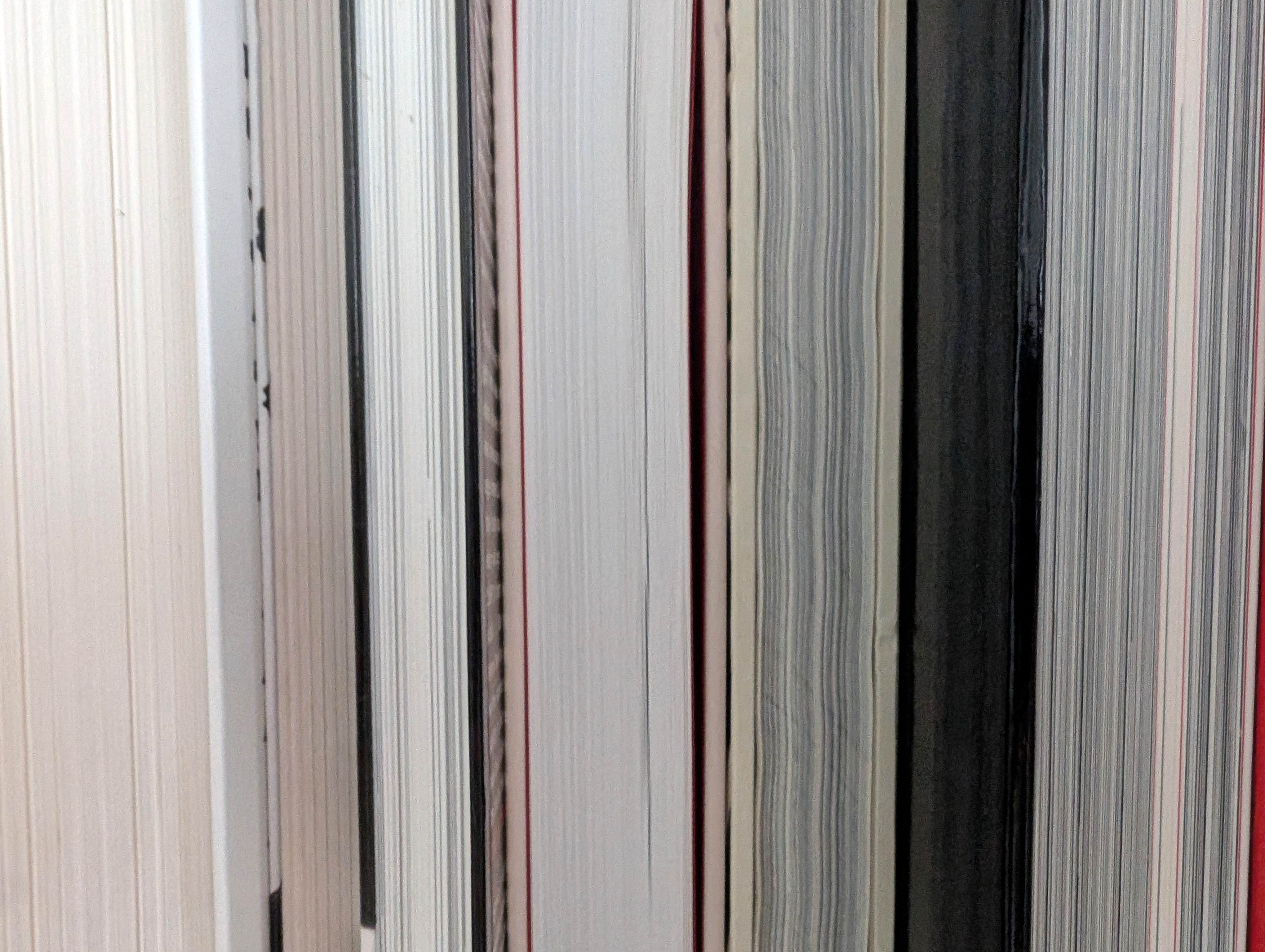
I see book after book printed on uncoated paper, with a tasteful colour cloth cover featuring some tasteful typography, with some polite text at the beginning or at the end, and page after right hand page of images placed in the centre of the white expanse that surrounds it. Perfectly nice photo books that neither challenge or engage the viewer. Books that exist for the photographer and no one else. Too harsh? Well, maybe, but I am passionate about photography and publishing, and photo books are the synthsis of both. They exist as an important artefact that shows future generations the state of the medium today. They are the evidence of what we are thinking, seeing and considering important in the 21st Century.
We are in troubled times, political times of social, economic and geographic upheaval and we have been for two and a half decades at least and yet photo books have rarely responded to this situation in subject matter or presentation. Too many in my opinion have been looking within rather than universally. Focused too much about the ‘self’ rather than the ‘other’. This is my opinion and it has been for some years, but I’m pleased to see that things may be changing. Not dramatically, but incrementally.
I am a big fan of Martin Amis’s https://photobookstore.co.uk and he has just posted, as he does each year, his favourite books of the past year https://photobookstore.co.uk/blogs/photobooks-of-2025. His selection shows an encouraging design shift. There still seems to be an obsession with images being placed on the right hand page with the left being blank (or occasionally solid black). However, full bleed images on the cover seems to be a new direction that is finally being explored, although this seems to be replacing the typographic cover by ensuing any type at all! No book title or in fact any information seems to be the new trend. A trend that makes no sense at all if you want to sell a book in a bookshop!
I come from a background of editorial design where text and image are seen as being of equal importance. Both supporting the other to create a stronger whole, but that is a dying art form as magazines and newspapers close and refuse to place importance on their design. The majority of graphic designers today do not see themselves as visual journalists as the people whom I was taught by once did. There is a reason why Avedon had Alexey Brodovitch (the art director of Harpers Bazaar 1934-1958 and mentor to Avedon, Diane Arbus, Eve Arnold, Hiro, Joel Meyerowitz, Lisette Model, Tony Ray-Jones, Jerry Schatzberg, and Garry Winogrand amongst many others) design his books. Editorial design is rarely about the designer. Instead it places the reader/veiwer as an important element of all design decisions. Unfortunately, this does not seem to be the case with the majority of photobooks I see, which appear to be created to please the photographer, designer or perhaps with compromise both. Creating visual knitting of typographic complexity, inappropriate conceptual outcomes or boring minimalism that fails to understand the potential power of design restraint.
Confusing or over-complex photo books kill photography; boring ones also kill photography. Two approaches with the same outcome and unfortunately I repeatedly see both. However, both could be avoided by asking yourself some simple questions, after you have answered the most important one, why should this book exist? Here are some follow up questions.
The first must always be, who is my audience? Who will buy the book? Then what will they pay and where will they buy it? Basic questions that will dictate size, pagination, paper stock and print run. Then produce a book that will engage with your audience. Don’t follow design templates, understand your narrative and allow the photographs to speak to you when it comes to how you lay them out (there is a link below explaining how to do this). These to me are essential questions to answer if you want to make a book and sell it. Of course you may just be making it for yourself and then you can just ignore everything I’ve just said!
Further Reading
https://unitednationsofphotography.com/2024/04/14/if-you-listen-to-photographs-they-will-talk-to-you-or-how-to-sequence-your-images/
https://unitednationsofphotography.com/2021/09/20/lets-talk-about-photo-book-design/
Dr.Grant Scott
After fifteen years art directing photography books and magazines such as Elle and Tatler, Scott began to work as a photographer for a number of advertising and editorial clients in 2000. Alongside his photographic career Scott has art directed numerous advertising campaigns, worked as a creative director at Sotheby’s, art directed foto8magazine, founded his own photographic gallery, edited Professional Photographer magazine and launched his own title for photographers and filmmakers Hungry Eye. He founded the United Nations of Photography in 2012, and is now a Senior Lecturer and Subject Co-ordinator: Photography at Oxford Brookes University, Oxford, and a BBC Radio contributor. Scott is the author of Professional Photography: The New Global Landscape Explained (Routledge 2014), The Essential Student Guide to Professional Photography (Routledge 2015), New Ways of Seeing: The Democratic Language of Photography (Routledge 2019), What Does Photography Mean To You? (Bluecoat Press 2020) and Inside Vogue House: One building, seven magazines, sixty years of stories, (Orphans Publishing 2024). His photography has been published in At Home With The Makers of Style (Thames & Hudson 2006) and Crash Happy: A Night at The Bangers (Cafe Royal Books 2012). His film Do Not Bend: The Photographic Life of Bill Jay was premiered in 2018.
© Grant Scott 2026


Leave a Reply