Thinking In Black and White; Not Just Dropping The Colour

There are photographers who never make work in colour, from conception to showing, but there are also many who only make images in colour with the belief that the final choice of how the image should look can be decided through a software package.

You used to have to make this choice when you loaded your camera. Black and white or colour film, a choice based on decisions other than just aesthetic. Cost was one, the ability to self-process and print another. Practical decisions. As a commissioned photographer I always used colour film and a pro lab, but I always had a couple of rolls of black and white loaded just in case that made sense on location. I used a specialist black and white lab and printer for that work. I saw them as different ways of seeing and working and I still do with my digital work.

I have one camera permanently set up for black and white, whilst my others are set for colour. That change of camera body forces me to think differently. To concentrate on light, shadows and mid-tones. Of course I consider all of these with colour photography but the removal of the consideration of colour aspects within the composition places a greater importance on them.

To make colour images and convert them to black and white in post-production removes this essential understanding at capture. That is just a fact. I have no issues with this form of image conversion but the lack of depth in the reasons for such change does raise questions.

I am sure that you have all seen someone post two images side by side on social media, one colour, one black and white, asking which is best? Such a question suggests further questions. The need for validation is clear but so is the lack of the photographers intention in making the image other than to seek approval through aesthetic judgement.

I often hear photographers giving the reason for making images black and white in post. These include that they look more moody, more classic, more serious, more retro, more interesting, more photographic. You get the picture! All are surface descriptions, they offer no sense of photographic foundation to the work.

Those who work in black and white and colour at capture have that foundation. They are not merely dealing with the surface. If you don’t believe me let’s consider what William Eggleston said about his use of colour, “The way I have always looked at the world is in colour. And there is nothing we can do about that.” And some words from Walker Evans, “Colour tends to corrupt photography and absolute colour corrupts it absolutely.” Two ways of seeing both as valid as each other. A difference to be respected if not necessarily agreed with. Not one to be ignored.
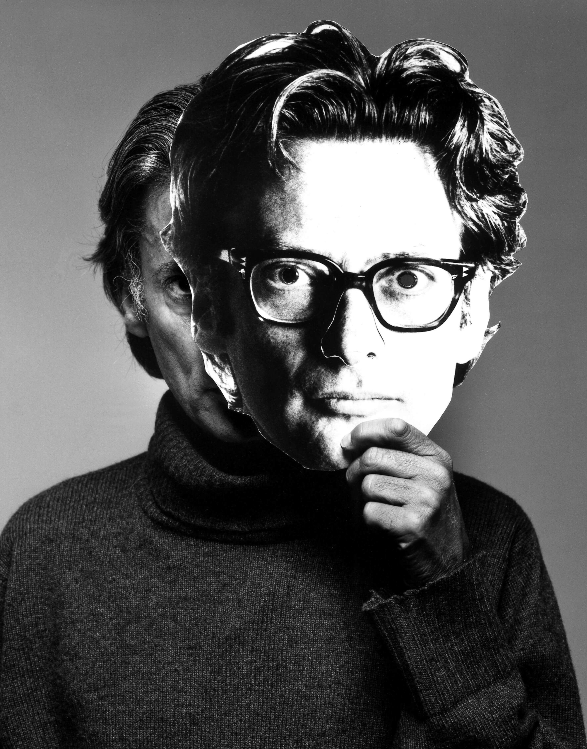
Dr.Grant Scott
After fifteen years art directing photography books and magazines such as Elle and Tatler, Scott began to work as a photographer for a number of advertising and editorial clients in 2000. Alongside his photographic career Scott has art directed numerous advertising campaigns, worked as a creative director at Sotheby’s, art directed foto8magazine, founded his own photographic gallery, edited Professional Photographer magazine and launched his own title for photographers and filmmakers Hungry Eye. He founded the United Nations of Photography in 2012, and is now a Senior Lecturer and Subject Co-ordinator: Photography at Oxford Brookes University, Oxford, and a BBC Radio contributor. Scott is the author of Professional Photography: The New Global Landscape Explained (Routledge 2014), The Essential Student Guide to Professional Photography (Routledge 2015), New Ways of Seeing: The Democratic Language of Photography (Routledge 2019), and What Does Photography Mean To You? (Bluecoat Press 2020). His photography has been published in At Home With The Makers of Style (Thames & Hudson 2006) and Crash Happy: A Night at The Bangers (Cafe Royal Books 2012). His film Do Not Bend: The Photographic Life of Bill Jay was premiered in 2018.

Scott’s next book Inside Vogue HouseOne building, seven magazines, sixty years of stories, Orphans Publishing, is now on pre-sale.

© Grant Scott 2024

3 comments

  1. I went to a photo school back in the early 1970s and the first year was entirely B&W… and started with a Sinar 5×4, white cube, white background paper, white card as reflector and an adjustable tungsten light with barn doors… with about 10 images to make from high key, full tonal range, extreme contrast, low key etc and all the time keeping the cube perfect. In the second year colour was introduced, but mainly transparency, and then colour negative. However I mainly thought in B&W.

    When I did my MA in Documentary Photography in 202/2004 it was almost all in colour (negative) although many of the images we examined and photographers who lectured worked in Monochrome. (Digital provided a notebook / record)

    With digital you can, given the funds, opt for a monochrome camera and not have any live view / rear screen, or a digital back for MF/LF work. However, I am fortunate that a friend has quantity of large format equipment and loves B&W film so yesterday we shot two images and processed them with a made developer, examined the negatives and reshot both with different exposure and development time… Nostalgic, yes; slowing down and thinking, yes; and we even found a use for mobile phone as a viewing screen programmed for the film size and lens before the camera was set up.

    In the evening I went out with my digital camera wanting an image in B&W but it was easy to get sidetracked by the colour on the screen, and I made 28 images, but ironically it was the first one that I ended up using – processing to standard B&W with a B&W red filter to bring out the wispy clouds. So 27 images wasted… Just suppose I have used a large format camera with one dark slide…

  2. The challenge using B&W film or using a dSLR with an optical viewfinder is “seeing” the composition monochromatically. It takes time to build that skill and foundation while viewing the world in its natural color through the viewfinder. Mirrorless cameras make this simple by allowing you to set the viewfinder to monochrome.

  3. The use of colour or black & white has always been a fascinating debate for me. I come from a family of practicing artists and creative people, but the matter was never really discussed in any depth.
    My older brother was an artist who used paint, inks pencil, charcoal, photography (both colour and black and white). He never thought it strange that I shot predominantly in black & white, although he often expressed an interest in the consideration I had for tonal range in my black & white work. He was never asked why he didn’t make a work in colour rather than black and white or shades of grey. People accepted that was his choice – whether it was a portrait, or landscape or combination of subject and medium.
    For myself, I happily shoot in both believing Eggleston and Evans were and remain correct in their analysis.
    I suspect people remain hung up on the idea that photography is a true rendition or to use an old modernist term ‘a mirror on the world’ and as such, is somehow less acceptable or convincing today in black & white. Black & white is not after all how we naturally see the world but ironically, this is one reason I love the black & white print – it is as much an abstract and subjective rendition of the world as a colour image. There are many colour photographers whose work I enjoy and respect – Eggleston, S. Shore, J. Sternfeld, P.Fraser, P. Graham, R. Kawauchi. The list is endless! But nor should we deny the beauty, the profoundly moving nature of the black & white image by the likes of W. Evans, S. Mann, C. Horsefield, E. Gowin, Lewis Baltz, J. Gossage, R. Adams, T.J. Cooper etc, etc?
    The use of colour rather than black & white should not be seen as a fashionable trend – something we do because the technology we use allows us more ‘accurate’ renditions. It is a choice, just as the distortion of colour and black & white imagery has been explored throughout the mediums history. A quick glance at the book ‘The Edge Of Vision’ by Lyle Rexer is testament to this fascination in deconstructing assumed properties of both colour and black & white photography. It’s abstract and it’s subjective. There are so many arguments for both perspectives and perhaps we just need to accept that each is valid in it’s own way and to each practitioner.

Leave a Reply

This site uses Akismet to reduce spam. Learn how your comment data is processed.

Discover more from The United Nations of Photography

Subscribe now to keep reading and get access to the full archive.

Continue reading